beyondAEC Hackathon 2017

The inaugural beyondAEC hackathon for the Greater Boston architecture, engineering, construction, and real estate development community was held on September 15-16, 2017. The competition consisted of a 24-hour window where teams of up to five could create never-before-seen technological solutions to challenges faced in the industry.

beyondAEC_logo.jpg

Held at Sasaki Associates in Watertown, the event was an overwhelming success with 43 registrants dividing into 10 project teams that consisted of: 7 college students (AEC and computer science), more than 25% women, and 21 different companies representing architecture, landscape architecture, construction, mechanical and structural engineering, technology and architecture consulting, computer science, software, and fabrication. In the end three projects were chosen for Most Impressive Use of Technology, Most Practical (could be used in an office "tomorrow"), and Best Cross-discipline Hack among teammates.

For a full recap of the event, winners, and photos head over to the beyondAEC.tech website.

MY SIDE OF THE STORY...

As one of the principal organizers of beyondAEC, my vision was to help propel the profession into the future by providing a forum where people could demonstrate technological expertise, learn new skills, and create something innovative through teamwork and collective resources. Teams naturally formed at the outset and the excitement and passion was palpable throughout as each worked diligently towards their ultimate deliverable. When the dust settled, I was blown away by the quality of the projects created and the sense of achievement -- I could not have asked for better turn out and participation. The hackathon provided a unique bonding activity across disciplines, experience levels, and offices to a level unlike any I have never seen in the Boston AEC space.

beyondAEC_KM announcements.jpg

We hope to make this an annual event and highly encourage participants from areas outside of Boston to join us as well. For future announcements, make sure to follow the beyondAEC Twitter account OR if you are interested in getting involved in the 2018 hackathon please supply your information through this form.

beyondAEC_post hack drinks.jpg

I cannot thank my team of collaborators enough for their persistent dedication and contributions -- Brad Prestbo, Jim Martin, Andrew Brown, Reilly Zlab, and Sebastian Ebarb. Thank you to our sponsors for taking the risk on this first event and helping bring it to life through their generous donations. Lastly, shout out to Jonatan Schumacher, Rob Otani, and Shannon McMullan from Thornton Tomasetti CORE Studio who put on one of the BEST hackathons year-after-year for the advice and inspiration.

Stairway to... Mt. Washington


Every March a group of Shepley Bulfinch employees (and friends) makes an excursion to the summit of Mount Washington. Situated in the the Presidential Range of the White Mountains in New Hampshire, Mount Washington is notorious for unexpected weather changes. Average temperatures for the month of March are a high of 20 degrees and a low of 5, with sustained wind gusts of up to 60 mph at the summit that can easily create a subzero windchill. Hiking at the tail end of Winter often means that crampons, ice axes, interchangeable layers, and many pairs of dry gloves are required equipment.

The hike itself lasts approximately 7-9 hours, covering 10.5 miles and nearly 4,250 vertical feet. After many months of hibernation during the blustery Boston Winter, serious training is necessary to prepare for the quad-burning ascent. Beginning 6-8 weeks prior to the climb, individuals begin hiking the egress staircase of the office building with reams of paper in their packs to simulate the weight of equipment and provisions carried on the day of the climb. This year everyone began recording their training sessions to stir up a little friendly competition and here are the results...

There are 16 floors in the office building and an approximated 736 average steps per lap (all the way up and down once) after accounting for the stairs, landings, intermittent stretch breaks, etc. Therefore it is estimated that the entire team collectively climbed roughly 349 laps, 11,168 floors, and took 257,269 total steps.

It looks like Monday, Wednesday, and Friday were overwhelmingly popular for making the time to fit in stair training around busy work schedules and other committments.

Here is the breakdown of number of laps per person:

...And an analysis of the average time per lap:
Notice that as weight and amount of laps increased, overall time would often slow down significantly.

We lucked out this year with sunny, warm weather for the entire hike. Everyone summited successfully and it was another fun-filled team experience.

Special thanks to our fearless guide David Meek who year-after-year invests hours of preparation and tireless effort to ensure a safe journey for all!

When 'Moneyball' Meets Ski Racing

This winter I joined an adult ski racing league and got back into the sport for the first time in over a decade. Each week racer performance is entered into a complex scoring rubric that determines overall team standings. After seven weeks of racing, this rich dataset was too tempting for a data visualization enthusiast like myself to pass up.

How the scoring works:

  • Each team consists of four members, they can be any combination of males and females.

  • Races occur once a week and two courses are set side-by-side, one red and one blue.

  • Every racer gets two runs per race, once on each course.

  • The racers are ranked according to previous week performance and are paired up by number, this means that you are racing an opponent on every run.

  • 2 Points are awarded if you earn a faster time than your opponent on each run. If your opponent does not show up to race that night and you succesfully finish your run, you receive an easy Win.

  • 2 Points are awarded if your time on a particular course is faster than the time you earned on that course (red or blue) the previous week.

  • Up to 4 Points are available if you earn a time within a given handicap time range. The breakdown of these times is as follows:

How the adjusted handicap time is calculated:

  • Every week, one or two pacesetters will ski the course before all the racers. Their times are divided by their individual nationally-certified handicap percentages to determine the best possible time on that particular course.

  • The fastest of the two pacesetter times is then multiplied against all of the other racers’ times to determine each person’s adjusted handicap time.

[To become certified, they attend a Regional Pacesetting Trials event where their top times are compared directly to those of US Olympian, Ted Ligety. To learn more about pacesetting, CLICK HERE.]

Back to scoring:

  • Each week racers can earn up to 12 Points for their team.

  • The top three highest scores from each team are taken and added to the team’s overall total.

  • At the end of seven weeks, the top 5 teams from each night of the week (Monday-Thursday) are qualified to compete in one final championship race. The highest scoring team wins.

At first the results were posted as paper print-outs which resulted in a few hours of manual data entry to build the initial database. After establishing a database, complex calculations were required to reverse engineer the scoring system and then emulate the score keeping based on each racer’s weekly results. Once again I turned to Dynamo’s visual programming capabilities to build a tool that could process all of the information.

Eventually the Nashoba ATR staff began posting the results to their website on a weekly basis which eliminated the need for both data entry and using Dynamo to compute all of the adjusted times and scoring. I could then quickly scrape the latest data each week and dump it into an excel spreadsheet where specific metrics were calculated. After using the handy data reshaper add-in for Excel, each spreadsheet was pivoted and then imported in Tableau for visualization. Now the performance of teammates against the rest of the league could be easily understood graphically:

As well as overall league standings:

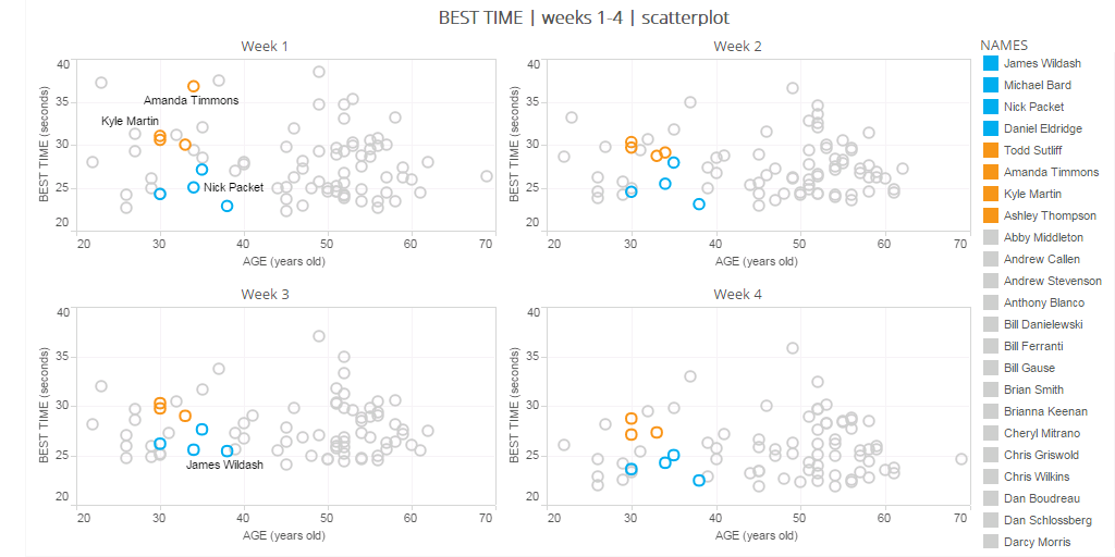
The complexity of the scoring system made for a relatively fair, enjoyable, and competitive experience regardless of age or gender. It also created some very interesting visualizations such as the breakdown of scoring by age and gender for the first four weeks:

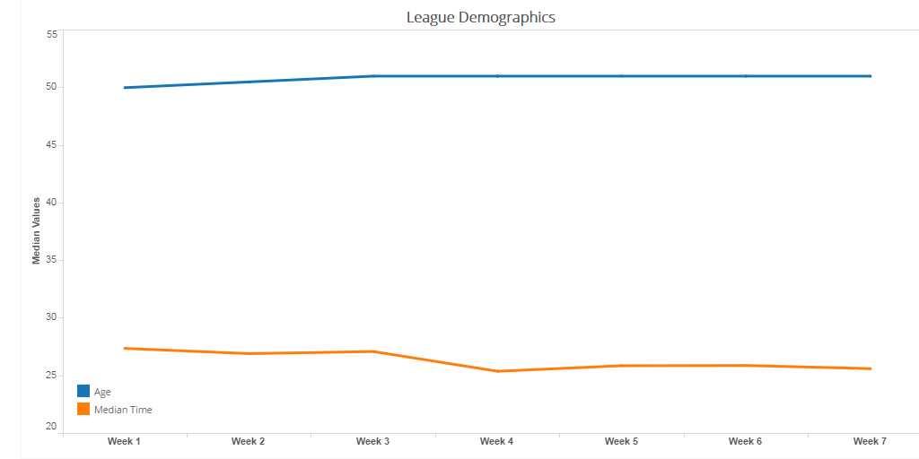
And the median age and time per race:

[Notice how the more “experienced” racers generally smoked the rest of the field.]

Ultimately the data helped me quickly understand the league and identify the nuances in scoring that could help improve my performance. It felt to get back out in the course after so many years, I cannot wait to do it again next season!

Shout out to my teammates and special thanks to Nashoba Valley Ski Area for generously posting results online and weekly updates. The original dataset can be viewed HERE.

PRCA Rodeo Map

Hebron Harvest Fair Rodeo - Hebron, CT

Hebron Harvest Fair Rodeo - Hebron, CT

Growing up in the agrarian state of Oregon, attending local rodeos during the summer was a favorite family activity. The raw athleticism, toughness, and tradition always made for good entertainment. The humility, sense of community, and incredible treatment of livestock instilled a deep admiration for the country folk for whom rodeo is their entire livelihood.

Unlike most professional sports, the cowboys and cowgirls are responsible for personally funding their own equipment, horses, lodging, and transportation. Their lives consist of driving hundreds, sometimes thousands, of miles between weekends to make it to the next rodeo where they compete for a paltry winner-takes-all purse in the 4-5 figure range. A missed lasso toss, a momentary loss of balance, or an overturned barrel can be the difference between earning enough to cover a few more weeks of food, gas, and supplies, or heading to the next event empty-handed. As if the meagre earnings aren’t enough of a deterrent, the physical toll and life-risking courage the sport demands are further testament to the passion and dedication these athletes possess.

Now having lived in Boston for the better part of a decade, my rodeo participation has been reduced to the occasional visit home or sporadic television broadcasts. Recently I was ecstatic to discover a rodeo in Northern Connecticut, however I had my doubts about the level of competition and authenticity. Given that the majority of rodeos occur in the western and southern portions of the United States, I wondered how much incentive an athlete would have to drive all the way to New England to compete. My curiosity got the better of me and I decided to look for a map of all rodeos in a given season of the Professional Rodeo Cowboys Association (PRCA), only to to find that no such map exists on the internet. Thus I set out to make my own map...

Data Acquisition:
The first step was to acquire the schedule for the 2015 rodeo season. The PRCA website does not contain a cohesive schedule for the entire season but does post the remaining season schedule as well as the results of each event that has already occured. Luckily the construction of the website is very simple, which made for easy scraping of the data into a format that can be processed.

PRCA 2015 Results
PRCA 2015 Remaining Schedule

Parsing and Re-structuring with Dynamo:
After collecting the lists of information for both the remaining schedule and results, I set out to use Autodesk Dynamo Studio 2016 to parse and re-structure the data for visualization. With the knowledge that the National Finals Rodeo event in Las Vegas in December marks the culmination of every rodeo season, I pared down all events to this timeframe, resulting in 620 total contests. This is a prime example of Dynamo as a powerful visual programming platform independent of Revit.

Visualization with Tableau:
The next step was to merge the two data sources and organize the information by: event name, city, state, country, and first day of event. Once everything was clean and consistent, I exported the data to Tableau for visualization. The Tableau map feature allowed me to position all 620 rodeos across the US and Canada and colorize them based on when they take place during the course of the season.

Takeaways:
In the end I was surprised to see a moderate cluster of dots in the New England region and was particularly pleased to find rodeos in Western New York, Massachusetts, Connecticut, and Maine. Perhaps there is a contingent of die-hard New England cowboys and cowgirls keeping the spirit of rodeo alive in the East? Regardless, my respect and admiration for this sport will always keep me coming back for more and I look forward to checking out the local rodeo scene. Enjoy!

Dynamo Studio "definition" for parsing and re-structuring the PRCA rodeo data.

Dynamo Studio "definition" for parsing and re-structuring the PRCA rodeo data.

Autodesk University 2014

Autodesk University
AU2014 Summary
December 2-4
Mandalay Bay, Las Vegas

Fusion 360 Digital Fabrication Workflows:

This course highlighted several features of Autodesk Fusion 360, a program that facilitates easy manipulation of 3D geometry otherwise difficult to achieve in Revit. After exporting a conceptual mass family from Revit to Fusion 360, an undulating wall form was created that could then be imported back into Revit, populated with curtain wall using adaptive components and rendered in a perspective street view with Google Maps background. That same form was imported into a program called Meshmixer that provides advanced options for preparing an STL file for 3D printing and allows you to apply custom supports. Altogether, the integrated workflow across several software platforms was relatively seamless and the course exhibited proof that very complex and customized geometry to be created in Revit for any project type.

Building a Good Foundation with Revit Templates:

Members of the architecture, engineering, construction and manufacturing industries gathered for this round table discussion about best practices for starting a project in Revit. Two methods were compared, the use of a Template File and Default Project. At Shepley Bulfinch, we use a template file at the outset of every project that contains a minimum amount of views, families and general standards to provide a good starting point. A default project has the advantage of carrying much more initial information including pre-placed families and objects but requires a significant time investment to keep the content current. Overall, the common sentiment in the room was that template files are easiest to maintain and offer the most versatility for any project type. Additionally, it is preferable not to “front load” Revit models and start out with unnecessary file size when one of the biggest challenges among all projects is keeping the model as small and responsive as possible.

Energy Analysis for Revit:

Are you familiar with the native energy analysis tool in Revit (hint: it’s under the Analysis tab on the ribbon)? This tool has the potential to be very helpful for early feedback to help drive the design. The task can be farmed out to the cloud for faster processing and to post reports for multiple options. For more in-depth analysis, the Revit model can also be exported to GBSxml format and opened in Green Building Studio, a cloud-based energy simulation platform. Relatively specific configurations are required within a model for the analysis to run successfully and one of the predominant takeaways of the course was the emphasis on modeling with energy analysis outcome in mind from the start of the project.

Challenges of LEAN Design and Computational Analysis:

This very engaging roundtable discussion examined the emerging role of computational analysis and generative design to help make more efficient design decisions. The keynote address at the beginning of the conference featured the use of "machine learning algorithms" where information and constraints are entered into a computer and simulations are run to determine an optimal design outcome. To start this session, we identified wastes and ineffective behaviors within each profession and in the collaboration process between. After a predictable round of architect-bashing, the question was proposed: "Does computation and simulation allow us to come to confident solutions earlier in the design process and reduce waste?" If existing condition information, user requirements, code constraints and many of the other variables that influence the design process can be programmed to generate permutations, is this a promising direction for the future of the profession? The group came to the conclusion that computational analysis and simulation will never be reliable enough to deliver a comprehensive design solution but may be helpful in providing direction at challenging moments in the process.

Practical Uses For Dynamo Within Revit:

Dynamo is a visual programming environment that allows you to make custom changes within Revit and extract information otherwise unattainable with the native program features. The program utilizes a user-friendly graphic interface to make adjustments within the Revit API (the "back end" which contains all the building blocks for how the program functions). This course demonstrated many entry-level uses for Dynamo including:

  • quickly making changes to all instances of a family type in a model (example: adjusting the offset height of all columns at once)
  • advanced family geometry (example: controlling profile order to create cantilevered and wrapped swept blends)
  • wrapping structure along curved surfaces
  • generating separate finish floor on top of slab automatically from room boundaries


Utilizing Revit Models for Architectural Visualization:

This course covered work flow and best practices for exporting a Revit model to the Unity 3D, a game engine that enables real-time visualization and walk-throughs. The first step is preparing the Revit model for export by cropping down only what you need with a section box and turning off unecessary categories in Visibility Graphics. Export the model to FBX and import it to 3DS Max where materials, cameras and lights are applied. Lastly the model is imported into Unity where perspectives, walk-throughs and animations can be utilized. In summary, Unity 3D provides a compelling presentation piece that may appeal to some clients but it is important to consider the time investment that goes into the preparation process.

Dynamic Energy Modeling:

An energy and environmental analysis consultant presented a multitude of methods for assessing daylighting, wind, weather, energy consumption and other performance characteristics of a design. Specific tools covered included eQUEST, Green Building Studio, Autodesk360 Lighting Analysis, raytracing and raycasting, Rushforth Tools Library, Autodesk Ecotect and more. Although these programs were generally too advanced for the level of in-house analysis we use at Shepley Bulfinch, I enjoyed learning about numerous ways information can be extracted from Revit and used to help inform the architectural design process.

Revit + Dynamo = The Building Calculator:

Beyond parametric modeling and making tweaks within Revit, Dynamo can be used to extract much of the information stored within a model. By using an "export to excel" function, areas, quantities, dimensions, room lists and so much more can be exported and analyzed with the powerful tools Excel has to offer. Schedules can be created, complex building calculations can be scripted and automatically updated upon every change within the model, or checks and balances for code and zoning can be integrated to produce reports. Items can then be adjusted, renamed or resized to push back into Revit from Excel and make direct changes to the model. Dynamo provides a giant step forward in the pursuit of harvesting the full potential of BIM.

The Great Dynamo Dig: Mine Your Revit Model:

With all this excitement surrounding Dynamo, did you know there is also a SQL export function? This allows for the creation of a much more comprehensive database that can be thoroughly organized using database management software and mined for analytics and appealing visual graphics in Tableau.